

KRIPTOMAT
CRYPTO
ABOUT
PROJECT
DETAILS
Project
Kriptomat
Project Type
Crypto SAAS
Duration
4 weeks
Year
2023
Service
Redesign website
Transforming Kriptomat's user experience: A Collaborative Journey in Redesigning and Enhancing Digital Transactions
Navigating the redesign project for Kriptomat's web app, our collective aim, as a team of UI/UX designers, centered on optimizing user transactions and seamlessly integrating the mobile app experience. Through collaborative efforts, we strategically crafted digital wireframes, ensuring a realignment of the user interface according to the project requirements. Our focus extended to establishing a design system and developing a contemporary UI design. In presenting the final design, we provided detailed documentation highlighting key features and enhancements, showcasing a comprehensive and user-centric approach to the project.
ABOUT
PROJECT DETAILS
Project
Kriptomat
Project Type
Crypto SAAS
Duration
4 weeks
Year
2023
Service
Redesign website
Transforming Kriptomat's user experience: A Collaborative Journey in Redesigning and Enhancing Digital Transactions
Navigating the redesign project for Kriptomat's web app, our collective aim, as a team of UI/UX designers, centered on optimizing user transactions and seamlessly integrating the mobile app experience. Through collaborative efforts, we strategically crafted digital wireframes, ensuring a realignment of the user interface according to the project requirements. Our focus extended to establishing a design system and developing a contemporary UI design. In presenting the final design, we provided detailed documentation highlighting key features and enhancements, showcasing a comprehensive and user-centric approach to the project.
GOALS
PROJECT
GOAL
With a dedicated focus on redesigning Kriptomat's homepage as a SAAS platform, the primary goal was to amplify user transactions through the mobile app. The strategic intent to drive mobile app downloads was realized by seamlessly incorporating captivating phone mockups throughout the design.
GOALS
PROJECT GOAL
With a dedicated focus on redesigning Kriptomat's homepage as a SAAS platform, the primary goal was to amplify user transactions through the mobile app. The strategic intent to drive mobile app downloads was realized by seamlessly incorporating captivating phone mockups throughout the design.
GOALS
PROJECT
GOAL
With a dedicated focus on redesigning Kriptomat's homepage as a SAAS platform, the primary goal was to amplify user transactions through the mobile app. The strategic intent to drive mobile app downloads was realized by seamlessly incorporating captivating phone mockups throughout the design.
GOALS
PROJECT
GOAL
With a dedicated focus on redesigning Kriptomat's homepage as a SAAS platform, the primary goal was to amplify user transactions through the mobile app. The strategic intent to drive mobile app downloads was realized by seamlessly incorporating captivating phone mockups throughout the design.
WIREFRAMES
JOURNEY
OF LO-FI
DESIGNS
Collaborative Wireframing Precision: Restructuring with Client-Centric Alignment
As a collaborative team, our contributions to the project involved the meticulous crafting of comprehensive digital wireframes. Strategically devised, these wireframes efficiently restructured various sections of the project, ensuring a seamless alignment with the specific needs and preferences outlined by our client.
WIREFRAMES
JOURNEY OF LO-FI DESIGNS
Collaborative Wireframing Precision: Restructuring with Client-Centric Alignment
As a collaborative team, our contributions to the project involved the meticulous crafting of comprehensive digital wireframes. Strategically devised, these wireframes efficiently restructured various sections of the project, ensuring a seamless alignment with the specific needs and preferences outlined by our client.
WIREFRAMES
JOURNEY
OF LO-FI
DESIGNS
Collaborative Wireframing Precision: Restructuring with Client-Centric Alignment
As a collaborative team, our contributions to the project involved the meticulous crafting of comprehensive digital wireframes. Strategically devised, these wireframes efficiently restructured various sections of the project, ensuring a seamless alignment with the specific needs and preferences outlined by our client.
WIREFRAMES
JOURNEY
OF LO-FI
DESIGNS
Collaborative Wireframing Precision: Restructuring with Client-Centric Alignment
As a collaborative team, our contributions to the project involved the meticulous crafting of comprehensive digital wireframes. Strategically devised, these wireframes efficiently restructured various sections of the project, ensuring a seamless alignment with the specific needs and preferences outlined by our client.
Digital wireframes
Digital wireframes
Digital wireframes
Digital wireframes
Design system
After finalizing the digital wireframe, we seamlessly transitioned to the subsequent phase of the project, setting up the design system. This involved meticulously defining visual elements, typography, color schemes, to ensure a cohesive and harmonious design language throughout the entire project.
Typography
Headings
example
parameters
font-family: Helvetica;
font-size: 56px;
line-height: 96%;
spacing: -3%;
weight: SemiBold;
Heading H1
font-family: Helvetica;
font-size: 42px;
line-height: 124%;
spacing: -3%;
weight: SemiBold;
Heading H2
font-family: Helvetica;
font-size: 24px;
line-height: 120%;
spacing: -2%;
weight: SemiBold;
Heading H3
Text color
Title
Hex
1D2B2B
RGB
29 43 43
Body text
Hex
4A5555
RGB
74 85 85
Primary color
Button
Hex
0C3C3E
RGB
12 60 62
Stroke
Hex
DBE2E4
RGB
219 226 228
Color 1 / BG
Hex
1C4F49
RGB
28 79 73
Color 2 / BG
Hex
1D6567
RGB
29 101 103
Color 3 / BG
Hex
D0E8EA
RGB
208 232 234
Color 4 / BG
Hex
F0F6F9
RGB
240 246 249
Color 5/ BG
Hex
DEECF1
RGB
222 236 241
Secondary colors (Decorative colors)
Hex
9AC7D1
RGB
154 199 209
Hex
DBE2E4
RGB
237 217 206
Hex
1C4F49
RGB
132 136 219
Hex
1D6567
RGB
44 130 133
Hex
D0E8EA
RGB
225 72 75
Hex
6E7879
RGB
110 120 121
Neutral colors
Hex
FFFFFF
RGB
255 255 255
Colors
Body
example
parameters
font-family: Helvetica;
font-size: 18px;
line-height: 170%;
spacing: -1%;
weight: Medium;
Body L
font-family: Helvetica;
font-size: 16px;
line-height: 154%;
spacing: -1%;
weight: Regular;
Body M
Typography
Typography
Headings
example
parameters
font-family: Helvetica;
font-size: 56px;
line-height: 96%;
spacing: -3%;
weight: SemiBold;
Heading H1
font-family: Helvetica;
font-size: 42px;
line-height: 124%;
spacing: -3%;
weight: SemiBold;
Heading H2
font-family: Helvetica;
font-size: 24px;
line-height: 120%;
spacing: -2%;
weight: SemiBold;
Heading H3
Text color
Title
Hex
1D2B2B
RGB
29 43 43
Body text
Hex
4A5555
RGB
74 85 85
Primary color
Button
Hex
0C3C3E
RGB
12 60 62
Stroke
Hex
DBE2E4
RGB
219 226 228
Color 1 / BG
Hex
1C4F49
RGB
28 79 73
Color 2 / BG
Hex
1D6567
RGB
29 101 103
Color 3 / BG
Hex
D0E8EA
RGB
208 232 234
Color 4 / BG
Hex
F0F6F9
RGB
240 246 249
Color 5/ BG
Hex
DEECF1
RGB
222 236 241
Secondary colors (Decorative colors)
Hex
9AC7D1
RGB
154 199 209
Hex
DBE2E4
RGB
237 217 206
Hex
1C4F49
RGB
132 136 219
Hex
1D6567
RGB
44 130 133
Hex
D0E8EA
RGB
225 72 75
Hex
6E7879
RGB
110 120 121
Neutral colors
Hex
FFFFFF
RGB
255 255 255
Colors
Body
example
parameters
font-family: Helvetica;
font-size: 18px;
line-height: 170%;
spacing: -1%;
weight: Medium;
Body L
font-family: Helvetica;
font-size: 16px;
line-height: 154%;
spacing: -1%;
weight: Regular;
Body M
Colors palette
Heading H1
Family: Poppins
Size: 48 px
Weight: Medium
Heading H2
Family: Poppins
Size: 40 px
Weight: Medium
Heading H3
Family: Poppins
Size: 32 px
Weight: Medium
Heading H4
Family: Poppins
Size: 24 px
Weight: SemiBold
Heading H4
Family: Poppins
Size: 24 px
Weight: Medium
Heading H4
Family: Poppins
Size: 24 px
Weight: Regular
Heading H5
Family: Poppins
Size: 20 px
Weight: Regular
Heading H6
Family: Poppins
Size: 16 px
Weight: SemiBold
Body text
Family: Poppins
Size: 16 px
Weight: Regular
Body text 2
Family: Poppins
Size: 14 px
Weight: Regular
Headings & parameters
Body text & parameters
Card mockup
#223ED3
Price increase
#119C6A
Price decrease
#ED4343
Secondary
colors
Primary
colors
Button
#C14B0A
Main BG
#010725
BG 2
#081245
Stroke & BG 3
#45589A
Text color
Headings
#FFFFFF
Body text
#D9D9D9
Neutral color
Gradient
#1B4BF3
#8556A3
Design system
After finalizing the digital wireframe, we seamlessly transitioned to the subsequent phase of the project, setting up the design system. This involved meticulously defining visual elements, typography, color schemes, to ensure a cohesive and harmonious design language throughout the entire project.
Typography
Headings
example
parameters
font-family: Helvetica;
font-size: 56px;
line-height: 96%;
spacing: -3%;
weight: SemiBold;
Heading H1
font-family: Helvetica;
font-size: 42px;
line-height: 124%;
spacing: -3%;
weight: SemiBold;
Heading H2
font-family: Helvetica;
font-size: 24px;
line-height: 120%;
spacing: -2%;
weight: SemiBold;
Heading H3
Text color
Title
Hex
1D2B2B
RGB
29 43 43
Body text
Hex
4A5555
RGB
74 85 85
Primary color
Button
Hex
0C3C3E
RGB
12 60 62
Stroke
Hex
DBE2E4
RGB
219 226 228
Color 1 / BG
Hex
1C4F49
RGB
28 79 73
Color 2 / BG
Hex
1D6567
RGB
29 101 103
Color 3 / BG
Hex
D0E8EA
RGB
208 232 234
Color 4 / BG
Hex
F0F6F9
RGB
240 246 249
Color 5/ BG
Hex
DEECF1
RGB
222 236 241
Secondary colors (Decorative colors)
Hex
9AC7D1
RGB
154 199 209
Hex
DBE2E4
RGB
237 217 206
Hex
1C4F49
RGB
132 136 219
Hex
1D6567
RGB
44 130 133
Hex
D0E8EA
RGB
225 72 75
Hex
6E7879
RGB
110 120 121
Neutral colors
Hex
FFFFFF
RGB
255 255 255
Colors
Body
example
parameters
font-family: Helvetica;
font-size: 18px;
line-height: 170%;
spacing: -1%;
weight: Medium;
Body L
font-family: Helvetica;
font-size: 16px;
line-height: 154%;
spacing: -1%;
weight: Regular;
Body M
Typography
Typography
Headings
example
parameters
font-family: Helvetica;
font-size: 56px;
line-height: 96%;
spacing: -3%;
weight: SemiBold;
Heading H1
font-family: Helvetica;
font-size: 42px;
line-height: 124%;
spacing: -3%;
weight: SemiBold;
Heading H2
font-family: Helvetica;
font-size: 24px;
line-height: 120%;
spacing: -2%;
weight: SemiBold;
Heading H3
Text color
Title
Hex
1D2B2B
RGB
29 43 43
Body text
Hex
4A5555
RGB
74 85 85
Primary color
Button
Hex
0C3C3E
RGB
12 60 62
Stroke
Hex
DBE2E4
RGB
219 226 228
Color 1 / BG
Hex
1C4F49
RGB
28 79 73
Color 2 / BG
Hex
1D6567
RGB
29 101 103
Color 3 / BG
Hex
D0E8EA
RGB
208 232 234
Color 4 / BG
Hex
F0F6F9
RGB
240 246 249
Color 5/ BG
Hex
DEECF1
RGB
222 236 241
Secondary colors (Decorative colors)
Hex
9AC7D1
RGB
154 199 209
Hex
DBE2E4
RGB
237 217 206
Hex
1C4F49
RGB
132 136 219
Hex
1D6567
RGB
44 130 133
Hex
D0E8EA
RGB
225 72 75
Hex
6E7879
RGB
110 120 121
Neutral colors
Hex
FFFFFF
RGB
255 255 255
Colors
Body
example
parameters
font-family: Helvetica;
font-size: 18px;
line-height: 170%;
spacing: -1%;
weight: Medium;
Body L
font-family: Helvetica;
font-size: 16px;
line-height: 154%;
spacing: -1%;
weight: Regular;
Body M
Colors palette
Heading H1
Family: Poppins
Size: 48 px
Weight: Medium
Heading H2
Family: Poppins
Size: 40 px
Weight: Medium
Heading H3
Family: Poppins
Size: 32 px
Weight: Medium
Heading H4
Family: Poppins
Size: 24 px
Weight: SemiBold
Heading H4
Family: Poppins
Size: 24 px
Weight: Medium
Heading H4
Family: Poppins
Size: 24 px
Weight: Regular
Heading H5
Family: Poppins
Size: 20 px
Weight: Regular
Heading H6
Family: Poppins
Size: 16 px
Weight: SemiBold
Body text
Family: Poppins
Size: 16 px
Weight: Regular
Body text 2
Family: Poppins
Size: 14 px
Weight: Regular
Headings & parameters
Body text & parameters
Card mockup
#223ED3
Price increase
#119C6A
Price decrease
#ED4343
Secondary colors
Primary colors
Button
#C14B0A
Main BG
#010725
BG 2
#081245
Stroke & BG 3
#45589A
Text color
Headings
#FFFFFF
Body text
#D9D9D9
Neutral color
Gradient
#1B4BF3
#8556A3
Design system
After finalizing the digital wireframe, we seamlessly transitioned to the subsequent phase of the project, setting up the design system. This involved meticulously defining visual elements, typography, color schemes, to ensure a cohesive and harmonious design language throughout the entire project.
Typography
Headings
example
parameters
font-family: Helvetica;
font-size: 56px;
line-height: 96%;
spacing: -3%;
weight: SemiBold;
Heading H1
font-family: Helvetica;
font-size: 42px;
line-height: 124%;
spacing: -3%;
weight: SemiBold;
Heading H2
font-family: Helvetica;
font-size: 24px;
line-height: 120%;
spacing: -2%;
weight: SemiBold;
Heading H3
Text color
Title
Hex
1D2B2B
RGB
29 43 43
Body text
Hex
4A5555
RGB
74 85 85
Primary color
Button
Hex
0C3C3E
RGB
12 60 62
Stroke
Hex
DBE2E4
RGB
219 226 228
Color 1 / BG
Hex
1C4F49
RGB
28 79 73
Color 2 / BG
Hex
1D6567
RGB
29 101 103
Color 3 / BG
Hex
D0E8EA
RGB
208 232 234
Color 4 / BG
Hex
F0F6F9
RGB
240 246 249
Color 5/ BG
Hex
DEECF1
RGB
222 236 241
Secondary colors (Decorative colors)
Hex
9AC7D1
RGB
154 199 209
Hex
DBE2E4
RGB
237 217 206
Hex
1C4F49
RGB
132 136 219
Hex
1D6567
RGB
44 130 133
Hex
D0E8EA
RGB
225 72 75
Hex
6E7879
RGB
110 120 121
Neutral colors
Hex
FFFFFF
RGB
255 255 255
Colors
Body
example
parameters
font-family: Helvetica;
font-size: 18px;
line-height: 170%;
spacing: -1%;
weight: Medium;
Body L
font-family: Helvetica;
font-size: 16px;
line-height: 154%;
spacing: -1%;
weight: Regular;
Body M
Typography
Typography
Headings
example
parameters
font-family: Helvetica;
font-size: 56px;
line-height: 96%;
spacing: -3%;
weight: SemiBold;
Heading H1
font-family: Helvetica;
font-size: 42px;
line-height: 124%;
spacing: -3%;
weight: SemiBold;
Heading H2
font-family: Helvetica;
font-size: 24px;
line-height: 120%;
spacing: -2%;
weight: SemiBold;
Heading H3
Text color
Title
Hex
1D2B2B
RGB
29 43 43
Body text
Hex
4A5555
RGB
74 85 85
Primary color
Button
Hex
0C3C3E
RGB
12 60 62
Stroke
Hex
DBE2E4
RGB
219 226 228
Color 1 / BG
Hex
1C4F49
RGB
28 79 73
Color 2 / BG
Hex
1D6567
RGB
29 101 103
Color 3 / BG
Hex
D0E8EA
RGB
208 232 234
Color 4 / BG
Hex
F0F6F9
RGB
240 246 249
Color 5/ BG
Hex
DEECF1
RGB
222 236 241
Secondary colors (Decorative colors)
Hex
9AC7D1
RGB
154 199 209
Hex
DBE2E4
RGB
237 217 206
Hex
1C4F49
RGB
132 136 219
Hex
1D6567
RGB
44 130 133
Hex
D0E8EA
RGB
225 72 75
Hex
6E7879
RGB
110 120 121
Neutral colors
Hex
FFFFFF
RGB
255 255 255
Colors
Body
example
parameters
font-family: Helvetica;
font-size: 18px;
line-height: 170%;
spacing: -1%;
weight: Medium;
Body L
font-family: Helvetica;
font-size: 16px;
line-height: 154%;
spacing: -1%;
weight: Regular;
Body M
Colors palette
Heading H1
Family: Poppins
Size: 48 px
Weight: Medium
Heading H2
Family: Poppins
Size: 40 px
Weight: Medium
Heading H3
Family: Poppins
Size: 32 px
Weight: Medium
Heading H4
Family: Poppins
Size: 24 px
Weight: SemiBold
Heading H4
Family: Poppins
Size: 24 px
Weight: Medium
Heading H4
Family: Poppins
Size: 24 px
Weight: Regular
Heading H5
Family: Poppins
Size: 20 px
Weight: Regular
Heading H6
Family: Poppins
Size: 16 px
Weight: SemiBold
Body text
Family: Poppins
Size: 16 px
Weight: Regular
Body text 2
Family: Poppins
Size: 14 px
Weight: Regular
Headings & parameters
Body text & parameters
Card mockup
#223ED3
Price increase
#119C6A
Price decrease
#ED4343
Secondary
colors
Primary
colors
Button
#C14B0A
Main BG
#010725
BG 2
#081245
Stroke & BG 3
#45589A
Text color
Headings
#FFFFFF
Body text
#D9D9D9
Neutral
color
Gradient
#1B4BF3
#8556A3
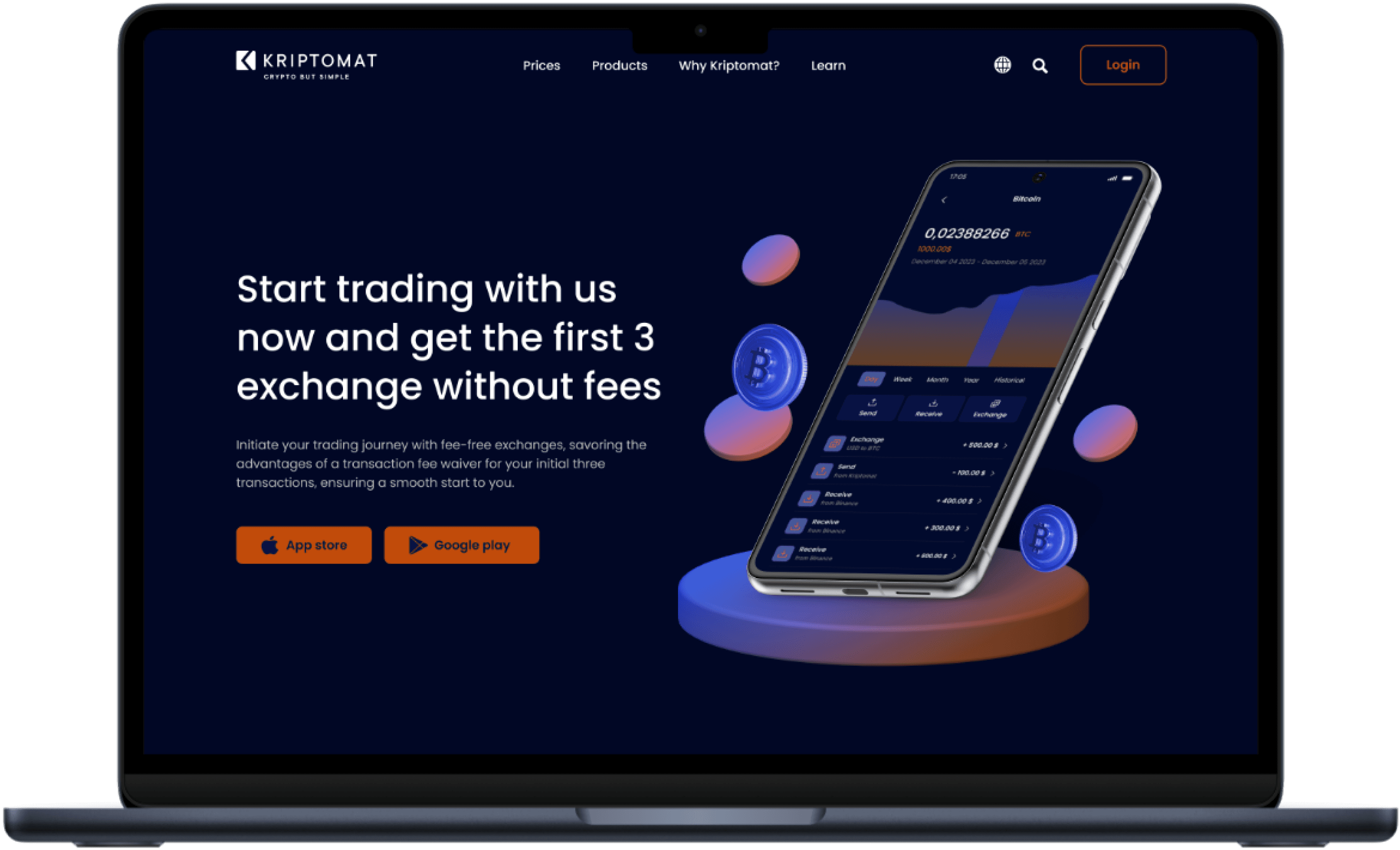
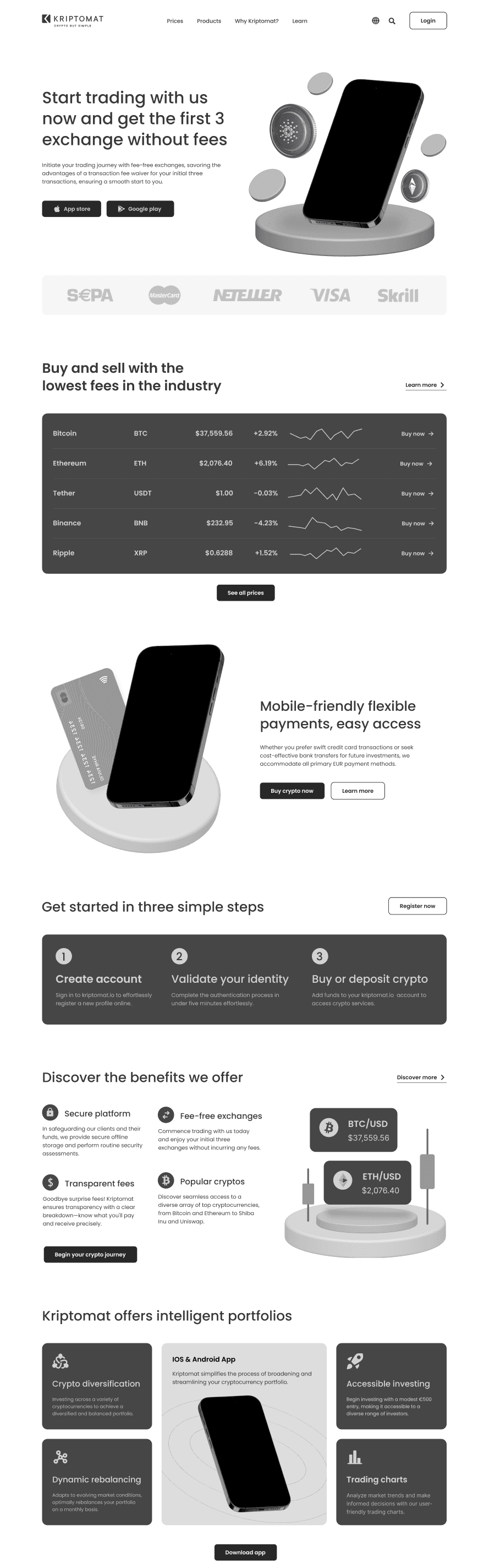
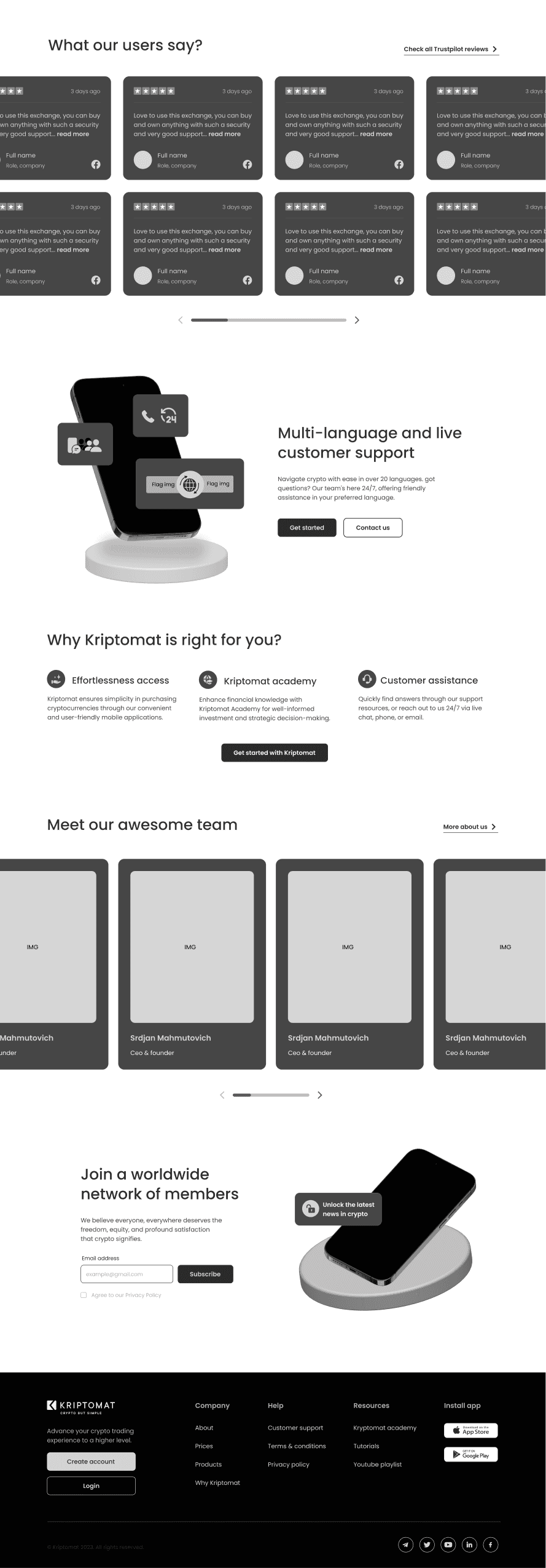
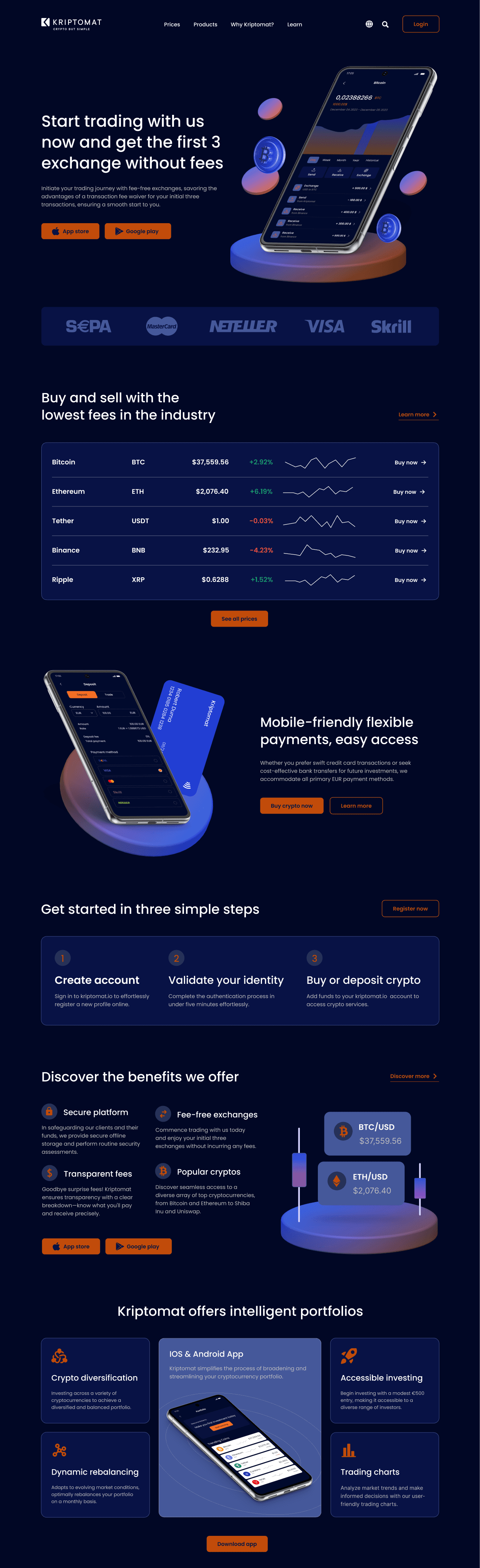
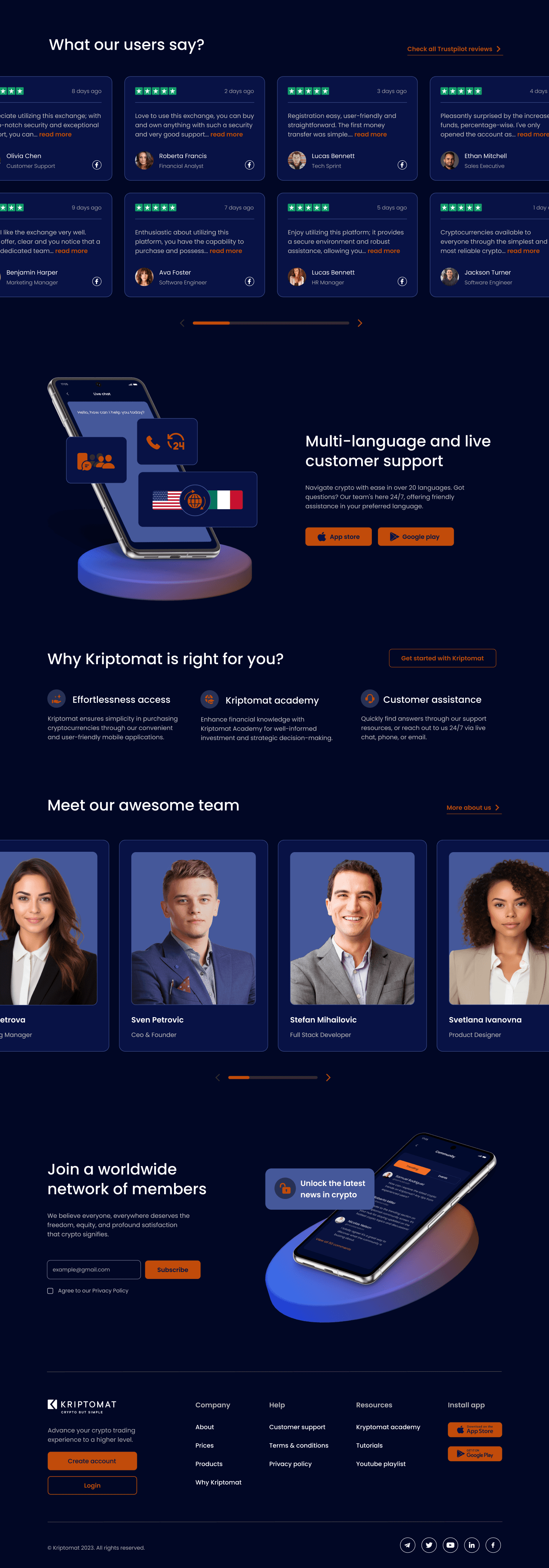
MAIN MOCKUPS
JOURNEY
OF HI-FI
DESIGNS
Building upon the digital wireframe foundation, the Hi-Fi design phase effortlessly materialized the homepage's final form. This pivotal stage involved seamlessly transitioning the wireframe into a pleasing and intuitively designed user interface. Meticulously applying visual elements, typography, and color schemes in alignment with the established design system, the result is a visually captivating and user-friendly homepage.
Dive into the Hi-Fi design showcase below, witnessing the seamless evolution from wireframe precision to the final polished interface.
MAIN MOCKUPS
JOURNEY OF HI-FI DESIGNS
Building upon the digital wireframe foundation, the Hi-Fi design phase effortlessly materialized the homepage's final form. This pivotal stage involved seamlessly transitioning the wireframe into a pleasing and intuitively designed user interface. Meticulously applying visual elements, typography, and color schemes in alignment with the established design system, the result is a visually captivating and user-friendly homepage.
Dive into the Hi-Fi design showcase below, witnessing the seamless evolution from wireframe precision to the final polished interface.
MAIN MOCKUPS
JOURNEY
OF HI-FI
DESIGNS
Building upon the digital wireframe foundation, the Hi-Fi design phase effortlessly materialized the homepage's final form. This pivotal stage involved seamlessly transitioning the wireframe into a pleasing and intuitively designed user interface. Meticulously applying visual elements, typography, and color schemes in alignment with the established design system, the result is a visually captivating and user-friendly homepage.
Dive into the Hi-Fi design showcase below, witnessing the seamless evolution from wireframe precision to the final polished interface.
MAIN MOCKUPS
JOURNEY
OF HI-FI
DESIGNS
Building upon the digital wireframe foundation, the Hi-Fi design phase effortlessly materialized the homepage's final form. This pivotal stage involved seamlessly transitioning the wireframe into a pleasing and intuitively designed user interface. Meticulously applying visual elements, typography, and color schemes in alignment with the established design system, the result is a visually captivating and user-friendly homepage.
Dive into the Hi-Fi design showcase below, witnessing the seamless evolution from wireframe precision to the final polished interface.
Homepage
Homepage
Homepage
Homepage
THANK YOU FOR EXPLORING THIS DESIGN SHOWCASE
THANK YOU FOR EXPLORING THIS DESIGN SHOWCASE
THANK YOU FOR EXPLORING THIS DESIGN SHOWCASE
THANK YOU FOR EXPLORING THIS DESIGN SHOWCASE